May-Jul 2021
DEEPO, Your only Productivity App
|
Project Duration: 1.5 Months
Product: Logo & Interactive Mobile App Tools used: Illustrator, Figma |
Logo Design, UX Design
Did all aspect of the project except art. |
PROJECT OVERVIEW
Design a logo for an imaginary project
I took the opportunity to design a logo for a personal project I am working on ~ DEEPO, a Time Tracker App.
MY VISION
Creating a fun and delightful experience while being productive
DEEPO is a gamified time tracker app that helps users better understand how they spend their time on daily activities and keep them in touch with their thoughts & emotions at the end of the day.
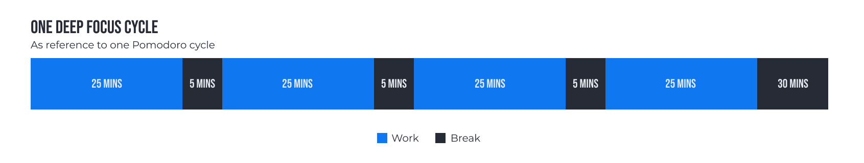
This idea was inspired by a pomodoro timer, journal, and a time tracking app.
I hope that by making this product, others can reap the benefits of being in control of their time at the same time improve their ability to plan, maintain motivations, and reduce mental fatigue.
IDEATION
My initial idea was very vague...
I want to create a mobile app that helps improve the life of others while also contain some form of game elements and currencies.
As usual, I start off with my quick and messy brainstorming, sketches, which I then transform them into digital wireframe for testing and eventually a high-fidelity prototype.

|

|

|

|
LOW FIDELITY DESIGN
Wireframing screens in Figma for better visualization
At this point, I am still trying to figure out how things can function together.
I quickly created:
I quickly created:
- An activities tab for users to track the total time spend on their daily activities.
- A tasks tab for user to create their To-do tasks.
- A notes tab for users to reflect at the end of their day.
Home and Timer screens (Wireframe)
As one my goal is to gamify the app, I had an idea of having a 3d visualization of an environment to portray the theme and fantasy within the app. I also like to focus on the main feature (Timer).

Activities screens (Wireframe)
The activity page allows user to add up to 5 activities and track them on a daily basis. User can get up to 15 activities upon unlocking the app 'Pro version'.

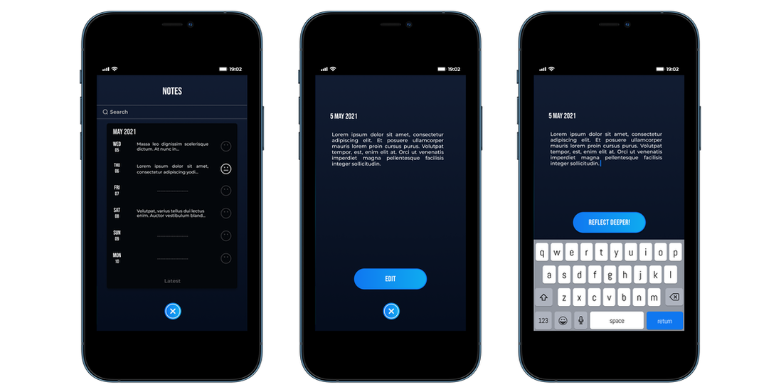
Notes and reflection screens (Wireframe)
Having a note and reflection screens allow users to jot down their accomplishment and thoughts after finishing a task.

USER TESTING + INTERVIEWS
Feedbacks gathered for my first wireframe design
- The app doesn't seem to have any unique selling point(s).
- It's an app that tries to do many things at once and failed to deliver anything good.
- 8 out of 10 users don't find it appealing and valuable enough to keep using the app.
So what's next?
I started to reflect upon 2 questions that arose after learning about what others comment:
With better vision, I begin to re-evaluate my wireframe, did a quick user flow, and decide on the feature(s) to focus on.
- How can I make it appealing to improve users' retention rates?
- Which feature is a better time investment to keep working on?
With better vision, I begin to re-evaluate my wireframe, did a quick user flow, and decide on the feature(s) to focus on.

DESIGN ITERATION 1
Home and Timer screens (Iteration 1)
On the home screen, I have used artwork from Pinterest as a placeholder for what I envision the theme to look and feel. I have also reduced the number of buttons/features on the screen and focused on making the experience of using the timer as intuitive as possible.

Activities screens (Iteration 1)
While adding the colors to my wireframes, I tend to always go for the minimal look to ensure good usability.

Notes screens (Iteration 1)
I have decided to keep the notes features as a form of journaling to motivate users to keep using the app.

USER TESTING + INTERVIEWS
Reviewed my design and gathered feedbacks again
- Look like a generic app, does not have anything fancy about it other than the illustration.
- Interesting concept; seeing some potential in it.
- Will it be appealing and valuable enough for users to use this as their main time tracking app?
With the gathered feedback I got from my friends and lecturer, I continued to push the design with the intention of introducing some kind of gamification and monetization for the long haul.
Below you will see how I have designed a gamified time tracking and productivity app which users can use to build a habit, jot down their thoughts, and discover fishes as a form of progression.
DESIGN ITERATION 2
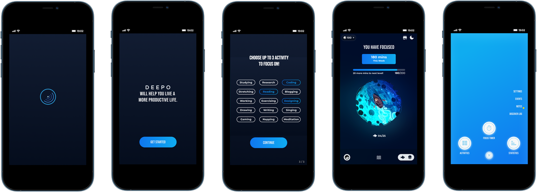
Home and menu screens (Iteration 2)
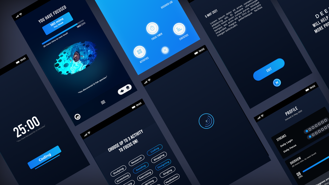
I have changed the generic look of the app while maintaining consistency across screens to give it a more interesting look and feel. Some added features for gamification include an in-app currency, black-market, fish discovery, day & night mode which affects discovery probability, profile, and level progression based on the number of minutes clocked.

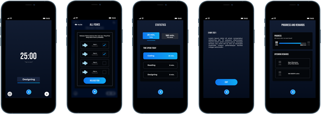
Fish discovery, Fish pet, and Statistics screens
Below you can see how the app motivates users to use the focus timer feature by rewarding them with new fish discoveries, which they could keep as pets or sell to the black market in exchange for DEEPO coins. The app also provides users useful statistics on how they spend their time daily and weekly in a minimal way.

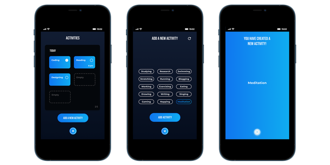
Activities screen (Iteration 2)
I have decided to change the way how users can add a new activity by providing them with a list of activities to choose from as I noticed many users get stuck on the add a new activity as they were unsure what activity to add by typing which reduces the overall experience. I also worked on making it 'fun' when users add a new activity with a rewarding end screen.
Profile, Progression, and Settings screens
Another way to improve user's retention rate was to have more rewards in the form of daily login and focus as well as unlockable environments the longer the user used the app. On the settings screen, users were provided with a clean and minimal options, with the call to action highlighted in blue - "Unlock Deepo Plus".
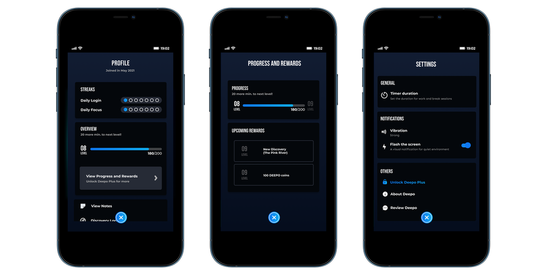
As someone who focuses on adding value, the app is intentionally designed with features to be good enough for users even without the need to purchase the full version. If users enjoy the product and want more, they can then purchase to gain access to more of the already 'enough' feature in the app (eg. ability to keep more fish, add more activities, track monthly time spend activities, etc.)
Note screens (Iteration 2)
Nothing much was improved besides ensuring that the visual elements and colors were consistent with the new changes.
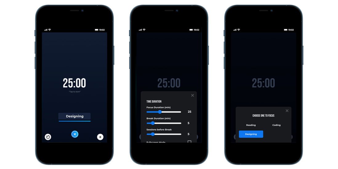
Timer screens (Iteration 2)
Finally the main feature of the app - the timer screens were designed with minimal and useful options to satisfy the users needs and experience. It was designed to be intuitive and visually appealing with the goal to create a lasting impression for the user.
FINAL DESIGN + PROTOTYPE
LOGO DESIGN - IDEATION
Quick sketches first
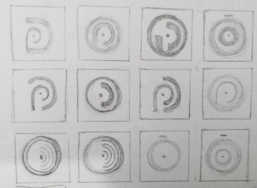
Keeping the vision of the product in mind, I aimed to create a logo that depicts the act of Deep Focus using the letter D, a focus lens, and a clock.
|
|
|
LOGO DESIGN - DIGITAL
Moving to the Digital Space
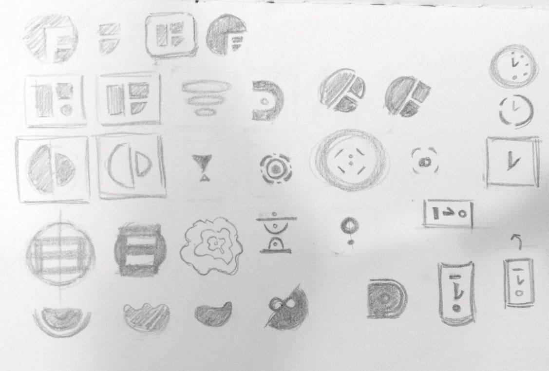
After bringing some of my logos to Adobe Illustrator and consulting my professor, Michael Thompson, I realized that all of my logos follow the rational approach of design which doesn't push things very far (Left image). After receiving the feedbacks, I then push myself to redesign the logos in a more intuitive approach, where I just think of the idea of time and start drawing shapes as quickly and intuitively as possible More abstracted and about the feeling more than the idea. (Right Image)
|
|
|
Another review session
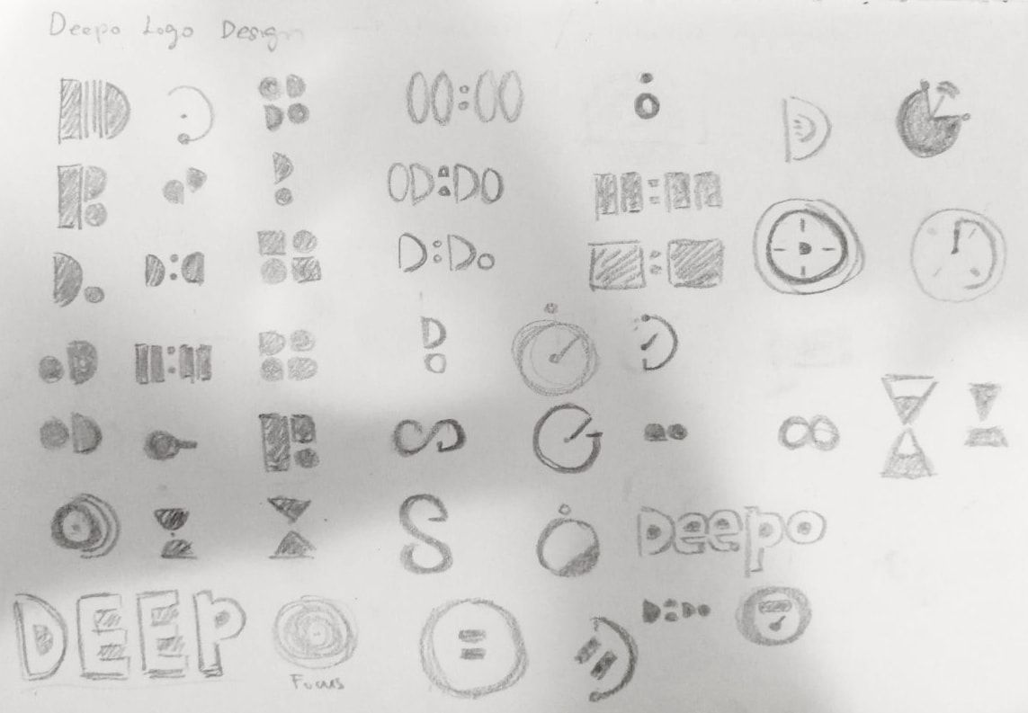
From the number of logos designed, I once again picked out a few of them and adds a background behind it to look at the logo silhouette and shape in a different perspective.
Moving on to the final step, I picked out one out of the selected logos and try to push the design further.
|
Finally, I have decided to settle for the 3rd design... but that's not the end yet.
As someone who is into minimalistic design, I then further simplify the logo and went for a blue color scheme which symbolizes serenity, in the hopes to calm the user's mind and slow down their heart rate whenever they start using the app. |
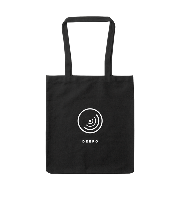
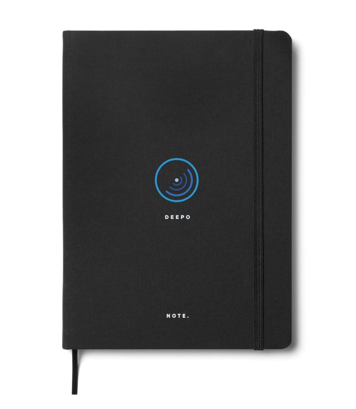
PRESENTATION
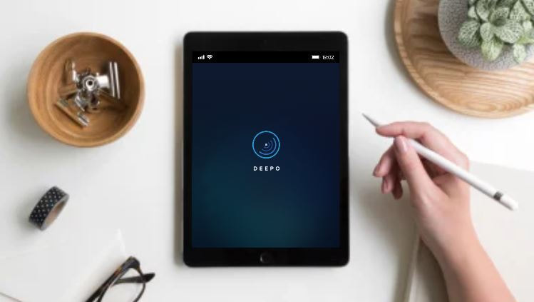
Displaying the logo on potential products
With the final logo design, I then put it on real life product to make it more presentable and professional to potential clients/users.
|
|
REFLECTIONS
This project pushes me to think about both the business and design aspect of a product
Here are some of my takeaways:
- Before starting any project, it's always good to ask if the product will be a right fit for the current economy.
- Always understand who the end user will be and have a 'giving first' mentality.
- Know how and when people will use the product, and WHY should they use it.
- Focus on making a product that solve one problem well, then build upon it.
© 2020 by Chu Rui Heng. All rights reserved.
