Oct-Nov 2021
Facebook Gaming Redesign
|
Project Duration: 1.5 Months
Product: Redesign an application Tools used: Figma, Photoshop, Illustrator Team Size: 6 |
UX Research, UX Design
UX Designer & project coordinator |
PROJECT OVERVIEW
Redesign and improve upon an existing software or application.
My team and I took this opportunity to redesign Facebook Gaming App where we focus on improving the overall screens flow, layout and user experience. My role for this project was to co-ordinate my team through the design process and help to deliver an interactive prototype for usability testing.
CONTEXT
What is Facebook Gaming?
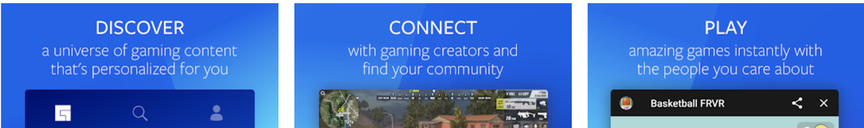
Facebook Gaming is a game streaming platform, where it allows users to watch games streamed live by other users and join groups for people to connect through their favorite games. Users can also play Facebook games directly from within the app and live stream them for monetization.
RESEARCH + USER GROUP
Did competitive research on 2 applications
To begin the project, my team and I did competitive research on similar applications such as Twitch and YouTube Gaming. We then established our primary, secondary and tertiary audience, followed by analyzing some of the good and bad design in Facebook Gaming app.
Target Audience
|
Primary: Young Adults
Age: 18 - 30
|
Secondary: Game Streamers
Age: 16 - 40
|
Tertiary: Teenagers
Age: 12 - 18
|
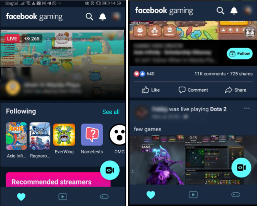
Some positive findings seen in Facebook Gaming mobile
Minimal Color scheme (+)
|
Facebook Gaming color scheme only consists of a few color choices and complements well with one another.
|
Easy Filtering (+)
|
Filtering options are easily accessible as scrollable buttons.
|
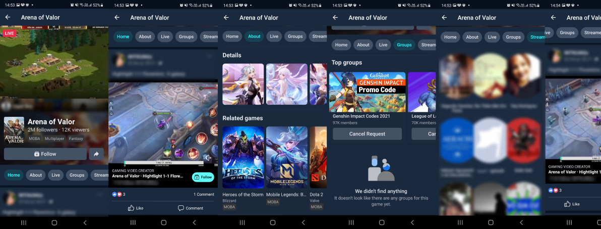
Some negative findings seen in Facebook Gaming mobile
Inconsistent use of icons & lacks clarity (-)

Android Tab

IOS Tab
|
FB Gaming icons are not intuitive and lack a correlation with what it represents. It is also inconsistent across different platforms.
|
Too many sub pages (-)
|
The UI Flow in FB Gaming goes too deep which tends to confuse users when navigating through the app doing a task.
Eg. Search > Games > Game Page > Groups > Group Page > Join |
Inconsistent button style (-)
|
Inconsistent visual style, as seen for the buttons. Also the choice of color is too much for the eyes.
|
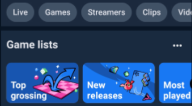
Clustered Search page (-)
|
Pages are bloated with options and content. The search page provides game lists, suggested games, top picks and live stream which can be quite overwhelming for first time user.
|
Inconsistent Layout & Interface (-)
|
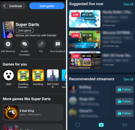
The color scheme and layout of the interface were different as compared to the other screens which made it feels like two different design.
An example of the inconsistency of design is the Continue and Quit game buttons that were placed in an unusual positions at the top of the screen (on the left image) which users would not normally interact with. |
USER JOURNEY
Empathizing with our user
After analyzing the app, we then created a user journey map to visualize the range of emotions of our user while doing a certain task. and came up with a list of high priority issues to improve upon.
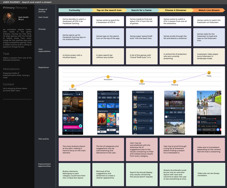
Issues to tackle
|
High Priority
|
Medium Priority
|
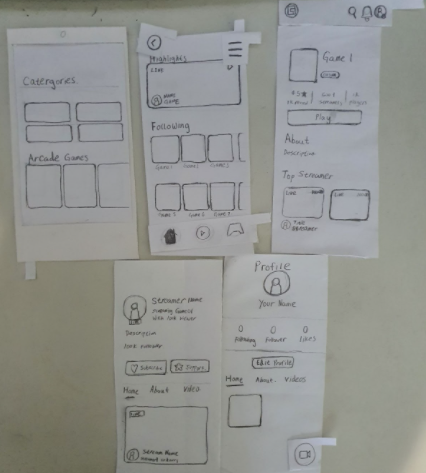
LOW FIDELITY DESIGN + TESTING + INTERVIEW
Having a paper prototype allow us to do quick iterations on the go
After setting our priorities, few of my team mates then proceeded with sketching the ideas on papers to create a paper prototype.
In order to improve navigation, we have decided to organize Facebook Gaming into 3 categories (Feeds, Streaming, and Gaming). This helped us have a clearer idea of what the users should see on each screen, while also allow us to communicate and assign tasks efficiently.
In order to improve navigation, we have decided to organize Facebook Gaming into 3 categories (Feeds, Streaming, and Gaming). This helped us have a clearer idea of what the users should see on each screen, while also allow us to communicate and assign tasks efficiently.
|
|
Preparing for playtest
After having most of the important screens on paper, we then find suitable people and carry out a quick playtest session with the following list of scenarios. In this stage, my role mainly involves observing and jotting down the actions as well as emotions of the play-testers while undergoing each of the task.
HIGH FIDELITY DESIGN
Moving on to Figma after getting a better idea of how the screen flow
We move on to our digital prototype in Figma, where we focus on tackling the issues of cognitive overload in some of our screens. Below are the screenshots of our iterated designs based on the insights and feedbacks we have gathered.
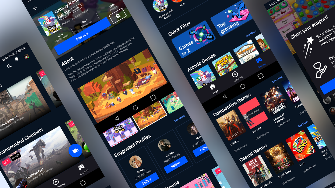
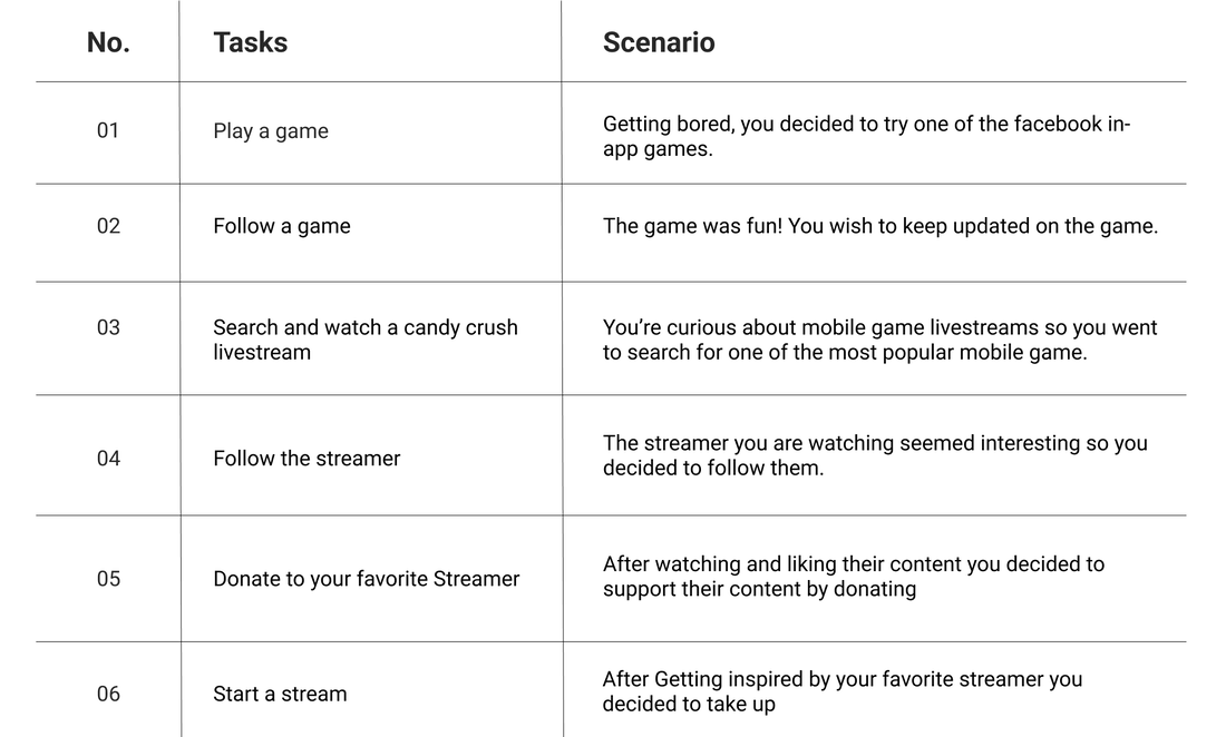
Feeds, Streaming and Gaming Tab screens
Providing clarity: The main icons displayed at the bottom of the screen are associated with a 'name' (Feeds, Stream, Gaming) to allow users to have an easier time identifying each icon as well as what to expect upon tapping on them.
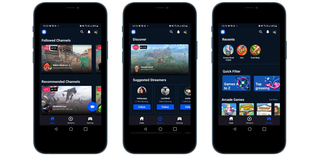
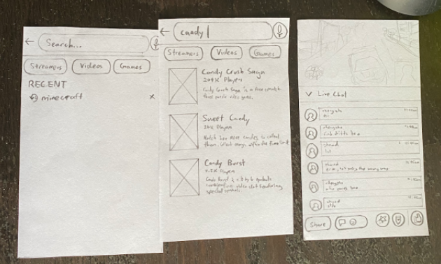
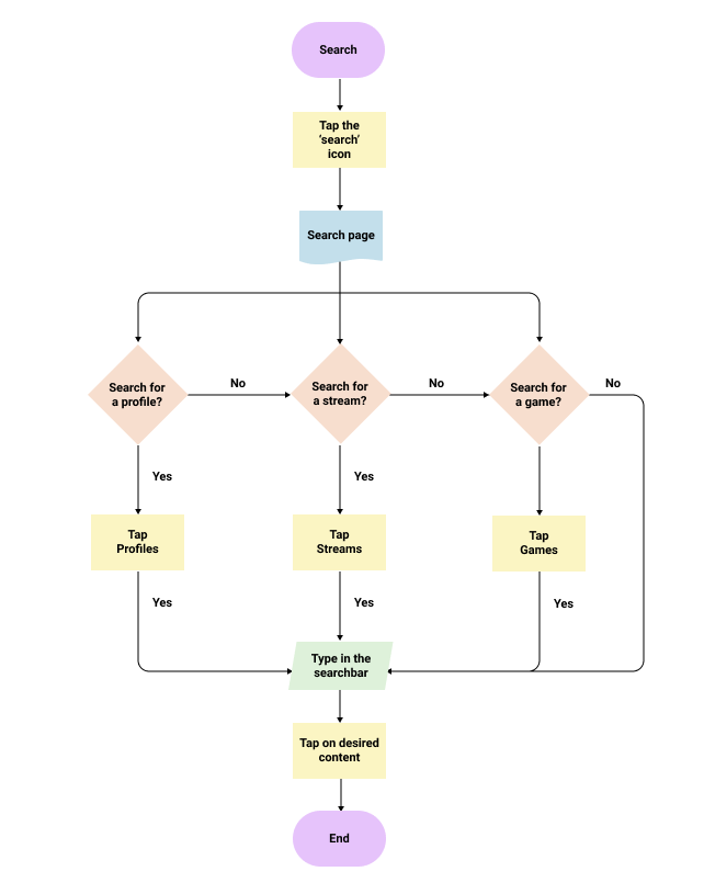
Search page screens
The search screens seen in the initial Facebook Gaming app were clustered with many information which tend to evoke confusion. In our iterated design, we focus on simplifying the number of elements on this screens to reduce cognitive overloading and potentially enhance the overall user experience.
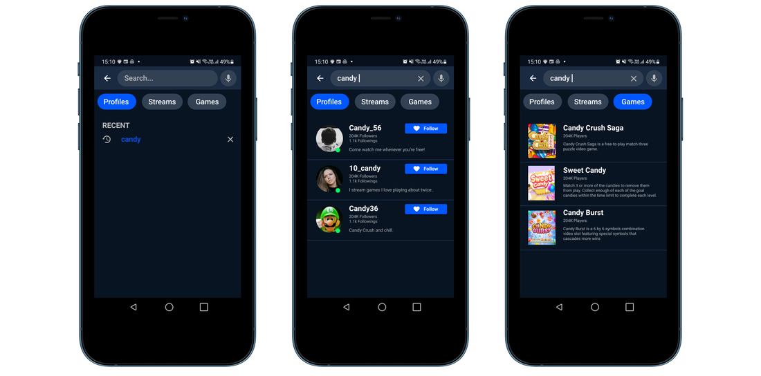
Game page and Gameplay screens
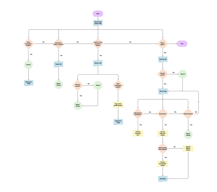
While reviewing the initial screen flow of Facebook Gaming, I happened to realize the overwhelming numbers of subpage that user will tend to go through while sourcing for a game to play or watch. To improve the UX flow for that, I have decided to have only as little subpage as possible.
As seen below, each game will have their own subpage which contains the description of the game, gameplay videos, suggested streaming videos and a play now button that then allow the user to choose their preferred game mode (Livestream or offline).
As seen below, each game will have their own subpage which contains the description of the game, gameplay videos, suggested streaming videos and a play now button that then allow the user to choose their preferred game mode (Livestream or offline).
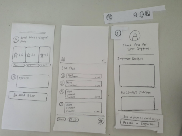
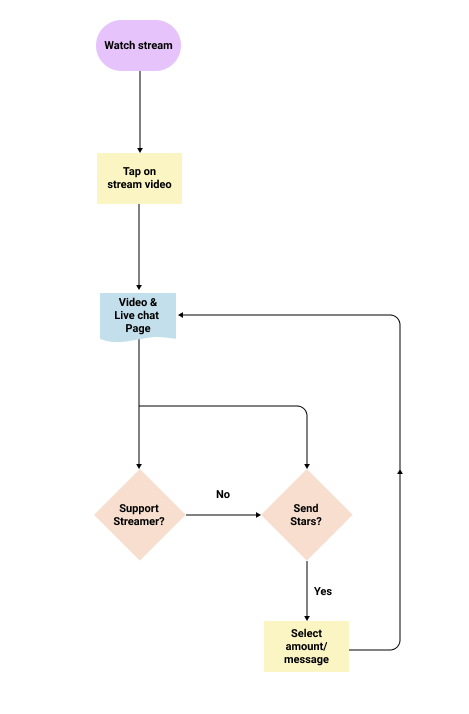
Streaming, Info and sending stars screens
While designing for the streaming screens, we encountered problems with users not knowing what is the meaning of the star icon as well as the supporter button. To solve that problem, my team have suggested displaying a one time descriptive pop up for users viewing a stream for the first time.
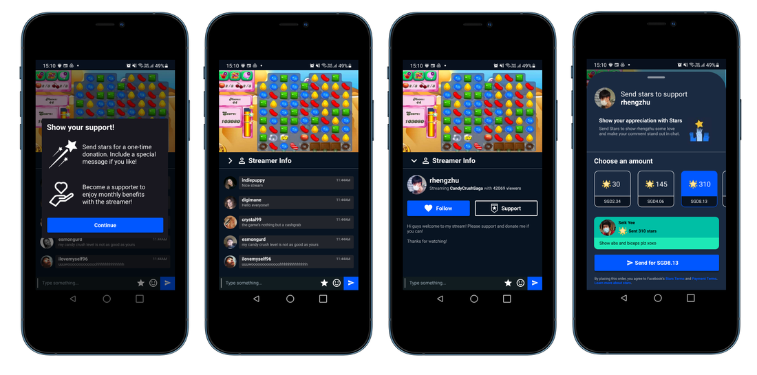
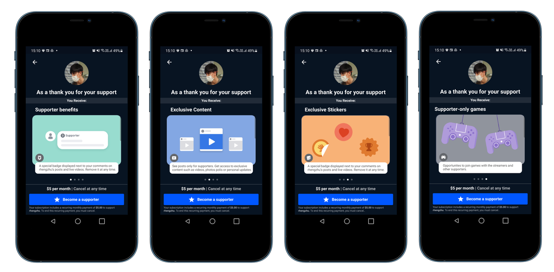
Support page screens
Scrapped screens design
Here are the previous iterations of the Feeds Tab. My team and I had discussed quite a number of time on what to show on the Feed Tab so that it can have a more distinct look as compared to the streaming tab. Some suggestions include adding a followed profiles and games as seen below.

HIGH FIDELITY PROTOTYPE
An interactive prototype was created in Figma where we then for usability testing and further iterations
Below is a little snip pic of how the screens in Figma were linked as well as a button link for you to experience the prototype hands on.
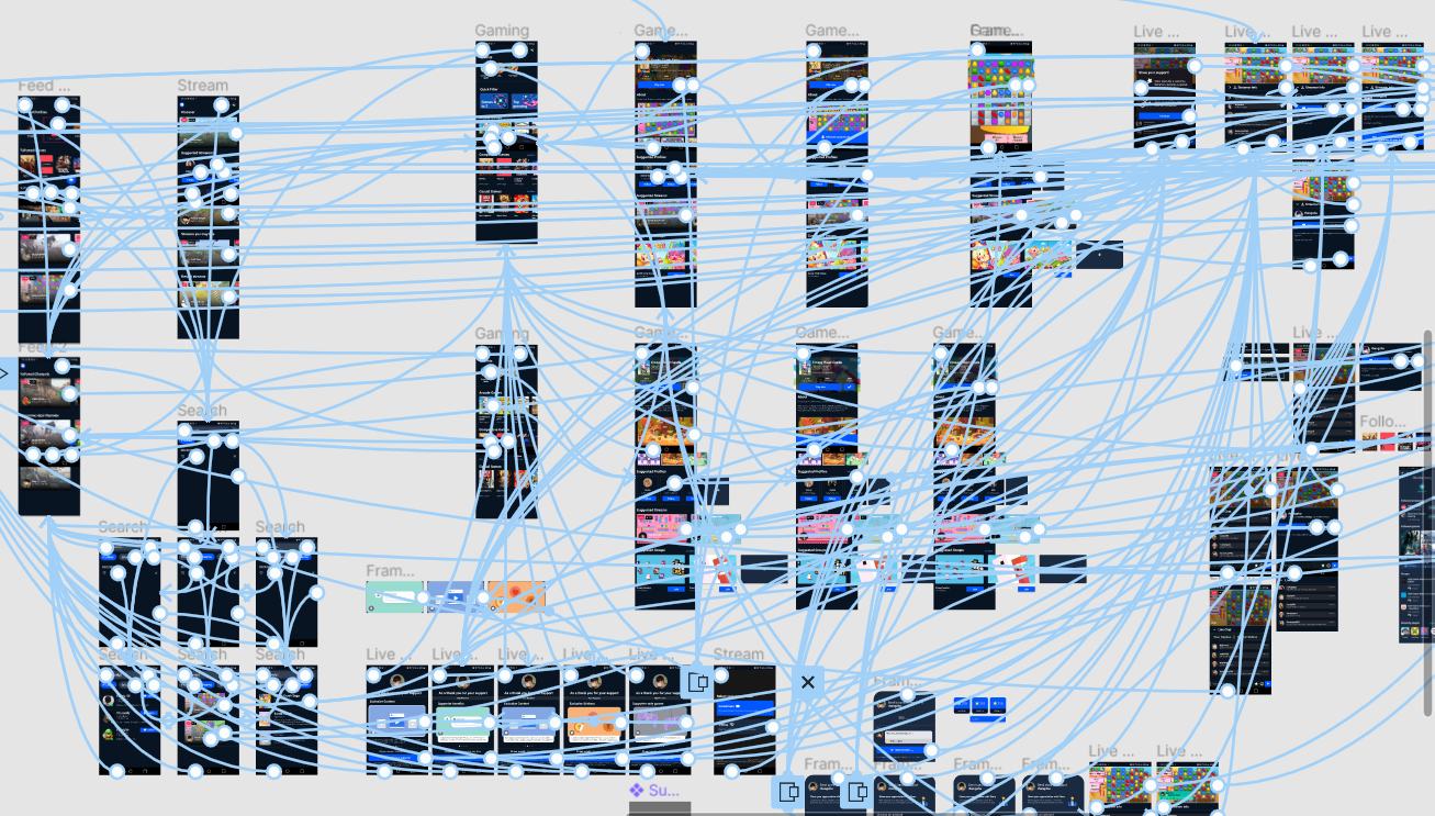
UI FLOW
|
|
REFLECTIONS
I learned that working in a team is not as easy as it seems
As this project is entirely done from home, we had to constantly set online meeting timings to work on the project and organize our playtest session through discord calls & MS Teams at every stage of the development.
Lots of communicating and planning is required to ensure that everyone is on the same page, and knows what to do.
