Jul-Sep 2021
VIBES, Your Virtual Networking App
|
Project Duration: 1.5 Months
Product: Interactive Mobile App Tools used: Figma |
UX Design & Research
Did all aspect of the project |
PROJECT OVERVIEW
Design an interactive app to pitch in a month
I took this opportunity to design VIBES ~ a social app based off pain points collected from existing social/dating apps.
MY VISION
Striving a balance between work and social life
VIBES is a gamified chat app which aims to elevate networking and to create a virtual place for people to be heard.
I hope that by using VIBES, users will be heard, be given the opportunity to have a deeper connection with others, and form their own meaningful experience to share.
PROBLEM
People experiencing more loneliness and mental health issues during the COVID-19 pandemic
It may be intuitive to say that being social has helped us to not only survive but thrive over millions of years.
As human beings, we all love listening to stories and enjoy being heard - Even the most introverted among us crave social contact from time to time.
While there are already quite a number of social apps being created to assist those who are looking for meaningful connections, they usually come with a card-swiping matching algorithm which can be a long and exhausting process, especially when one is lacking social connections.
THE SOLUTION
1. Anonymous messaging first, match later
|
Have a conversation anonymously
|
2. Play games to form deeper connections
|
3. Have a long term connections with up to 5 people
|
Match with someone who shares your interests
|
4. Share your thoughts and reply to others using the notes feature
|
Receive/send heartwarming advices
|
5. Design with user engagement in mind
|
Have a good time socializing and earning daily rewards
|
USER RESEARCH + PERSONAS
Understanding the users is an important part of the process
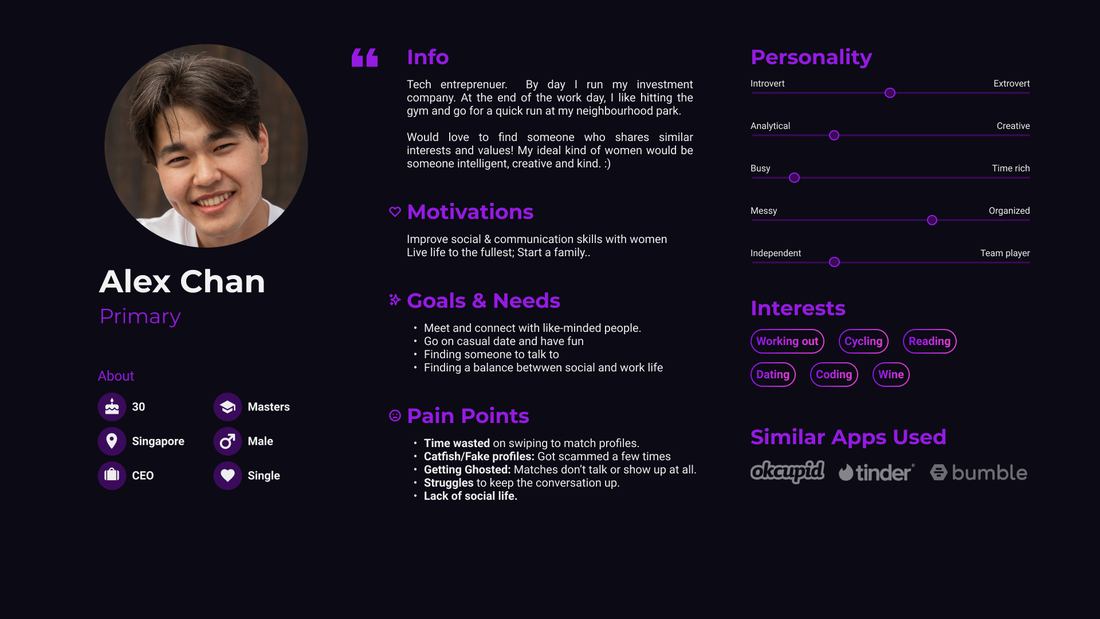
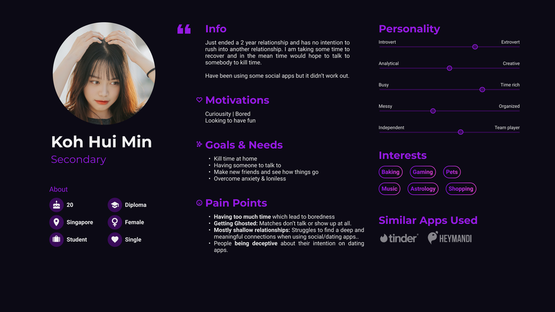
Before starting the project, I conducted interviews and created user personas to understand the motivations, and needs of the users I'm designing for.
User personas
|
|
Primary user group consists of working adults, preferably singles who has the habit of using dating apps and seeks a deeper connection.
Secondary user group consists of people in their early 20s, who are just looking for someone to talk to and have fun with.
Pain points gathered from interviews + research
- Exhausting: Users find it very time consuming to swipe profiles and wait to get matches.
- Getting Ghosted: Even after getting matched, it takes a while before someone initiate a conversation; worst case scenario, no conversation was started.
- Competing for attention: Users get tired constantly carrying the conversation and trying to get the attention of the other person.
- Shallow relationship: Conversation doesn't last long and usually end up having one person feeling rejected.
Negative dating app experiences, such as ghosting, lead plenty of people to question their physical traits, communication skills, and compatibility with potential dates.
*according to a University of North Texas study
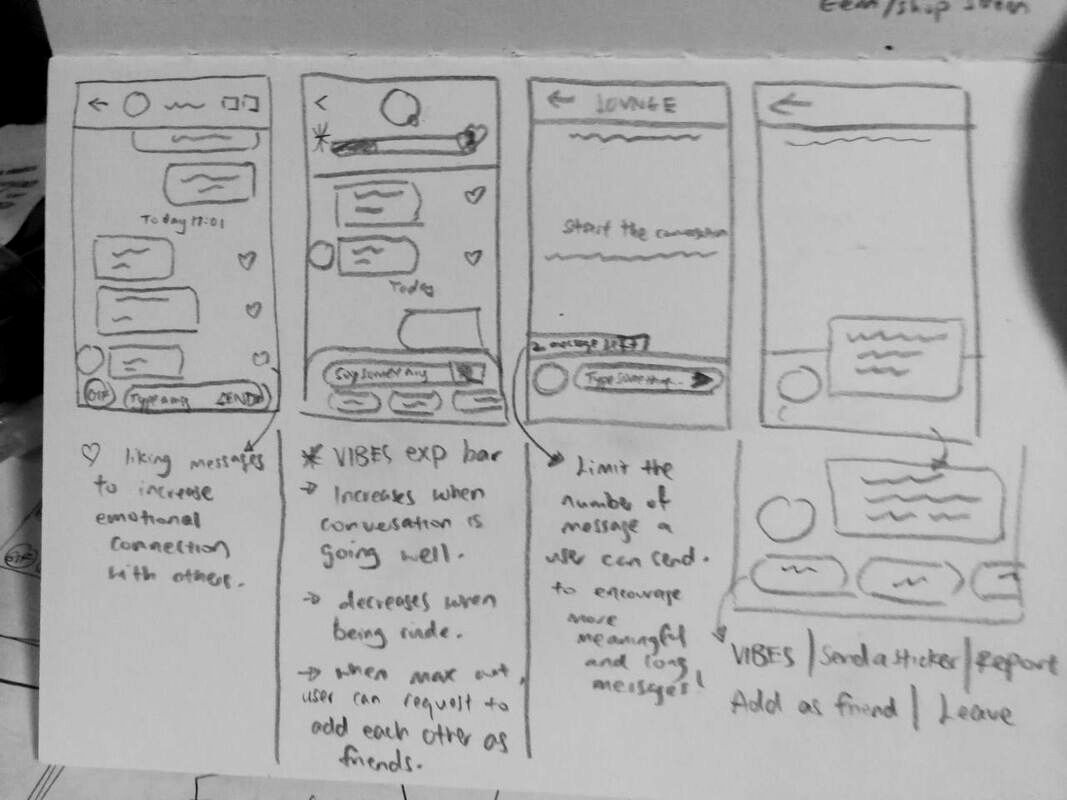
LOW-FIDELITY DESIGN
Ideation on paper
Before working on the prototype, I usually like to begin by collecting inspiration online and jotting down useful learning points from other similar product be it apps or games, while keeping in mind the pain points of my users.
|
|
|
PS: As the main goal of the project was to create a visually appealing product within the given timeline, I have skipped the wireframing phase and jumped straight into making the high-fidelity screens based off my notes.
HIGH FIDELITY DESIGN
From Paper to Digital
With the ideas and notes I had, I then started to work on the mockup screens in Figma.
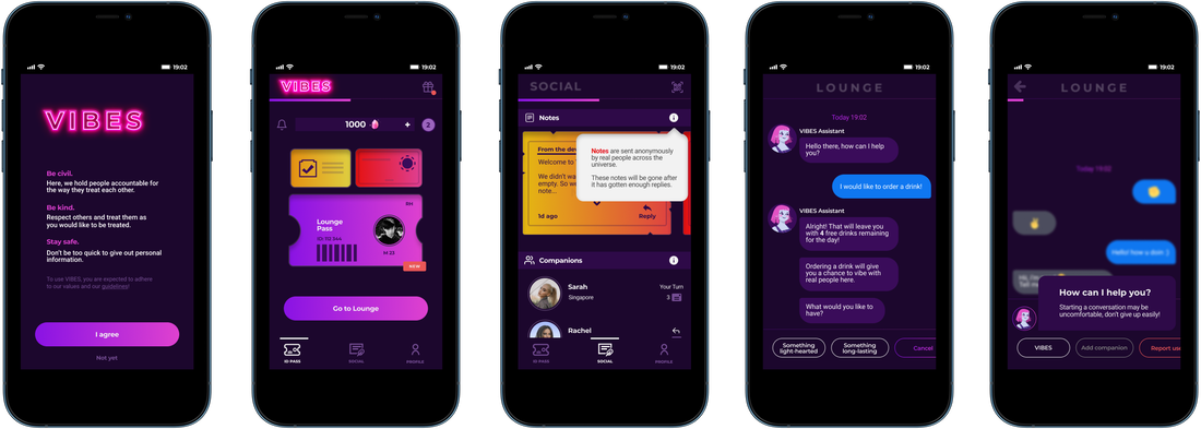
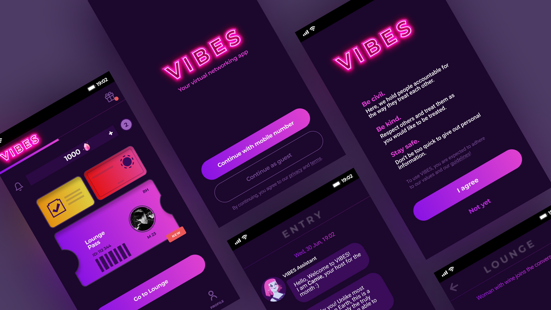
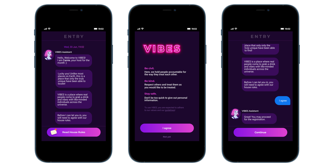
Onboarding screens
If users don't understand your app, they won't use it!
When designing the onboarding screens for VIBES, I make sure that it was kept simple, welcoming and as user-friendly as possible. Being aware that onboarding is one of the most important phases of a mobile app user's journey, I took time to plan and iterate on the flow for each screen, with the intention to emphasize the app's value and guide the users through the features in a progressive manner.
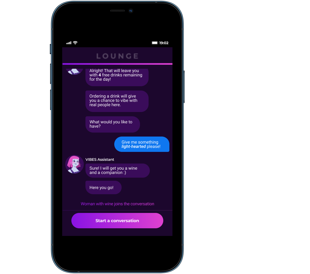
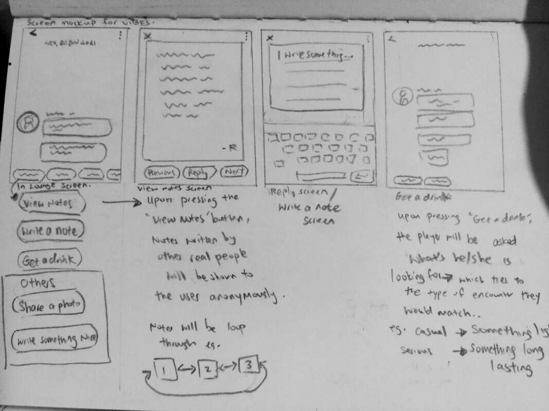
Anonymous messaging screens
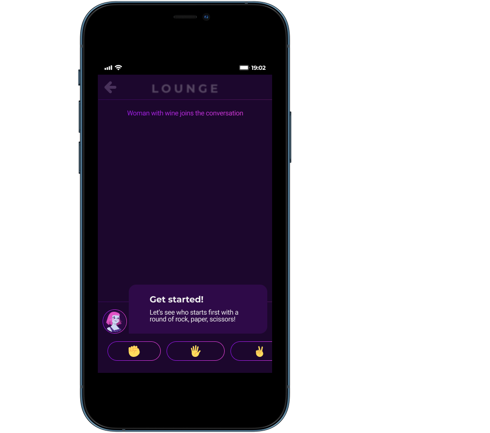
Introducing the core feature of the app: During the matchmaking process in VIBES, users will be asked to pick a drink: Something light-hearted or Something long lasting. Users will then be matched with another person based on their choice and preferences. Upon matching with someone, users will play rock, paper ,scissors to determine who starts the conversation.
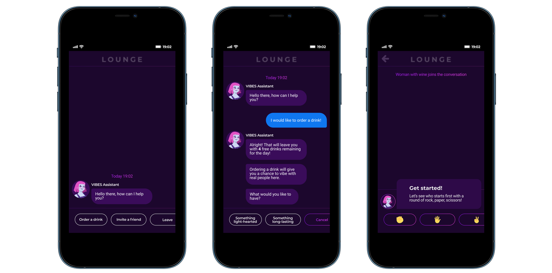
To ensure the user feel safe and comfortable, the app allows the users to tap on the AI chatbot icon to seek help with ice breaker questions at any point during the messaging phase.
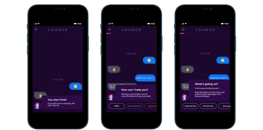
If the conversation is going well, users will be given the opportunity to add each other as companions, in which their profiles will be revealed and saved within the app. Whereas if the conversation is NOT going well, users have the choice to report or leave the room.
If the conversation is going well, users will be given the opportunity to add each other as companions, in which their profiles will be revealed and saved within the app. Whereas if the conversation is NOT going well, users have the choice to report or leave the room.
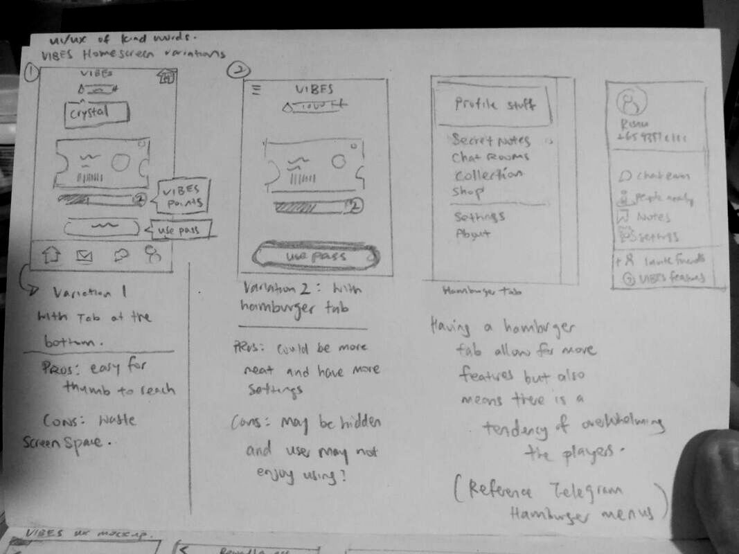
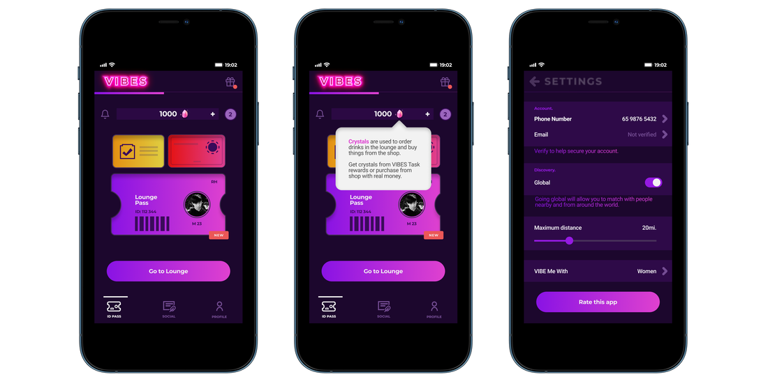
VIBES Home and setting screens
With the goal to keep the design simple and easy to understand, I stick to the rule of 3 while designing the home screens to give a good sense of balance and avoid having a layout that overwhelms the users.
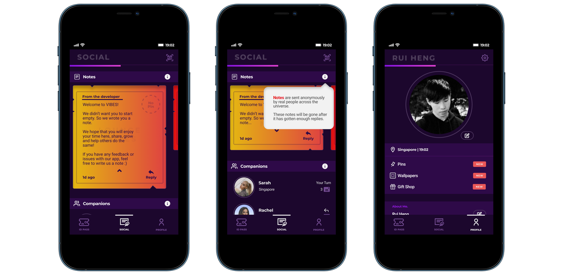
Social and profile screens
VIBES also offer another way for users to interact with one another
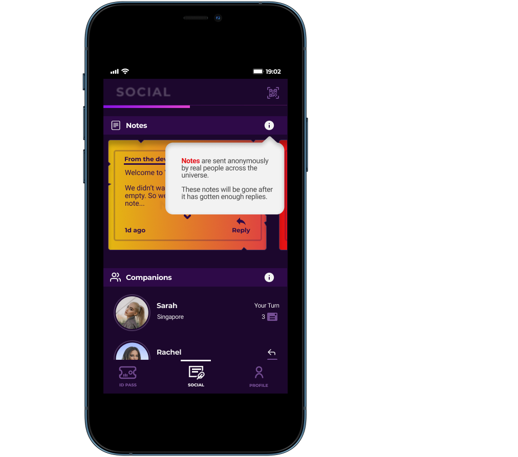
Besides connecting with other users through matchmaking, users can also write and reply to anonymous notes or request for a note to be sent to others. To make sure that the note feature will be used by users, I decided to limit the amount of companions each user can add to 5. By having such limitations in the app, not only will it make every connection more meaningful and valuable, it also opens up opportunities for monetization.
Besides connecting with other users through matchmaking, users can also write and reply to anonymous notes or request for a note to be sent to others. To make sure that the note feature will be used by users, I decided to limit the amount of companions each user can add to 5. By having such limitations in the app, not only will it make every connection more meaningful and valuable, it also opens up opportunities for monetization.
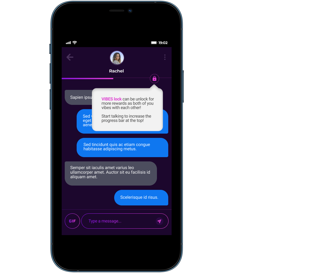
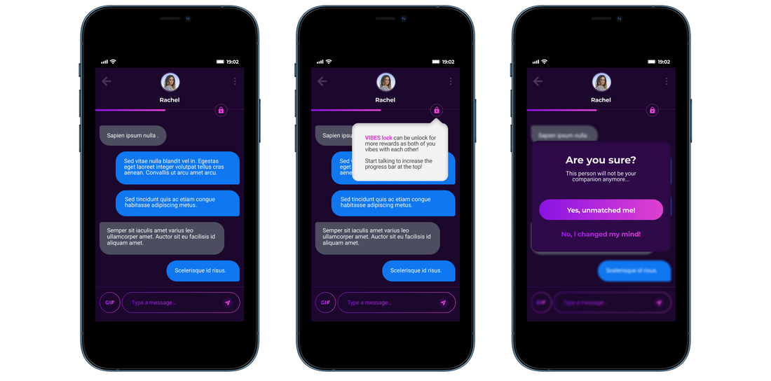
Messaging a companion screen
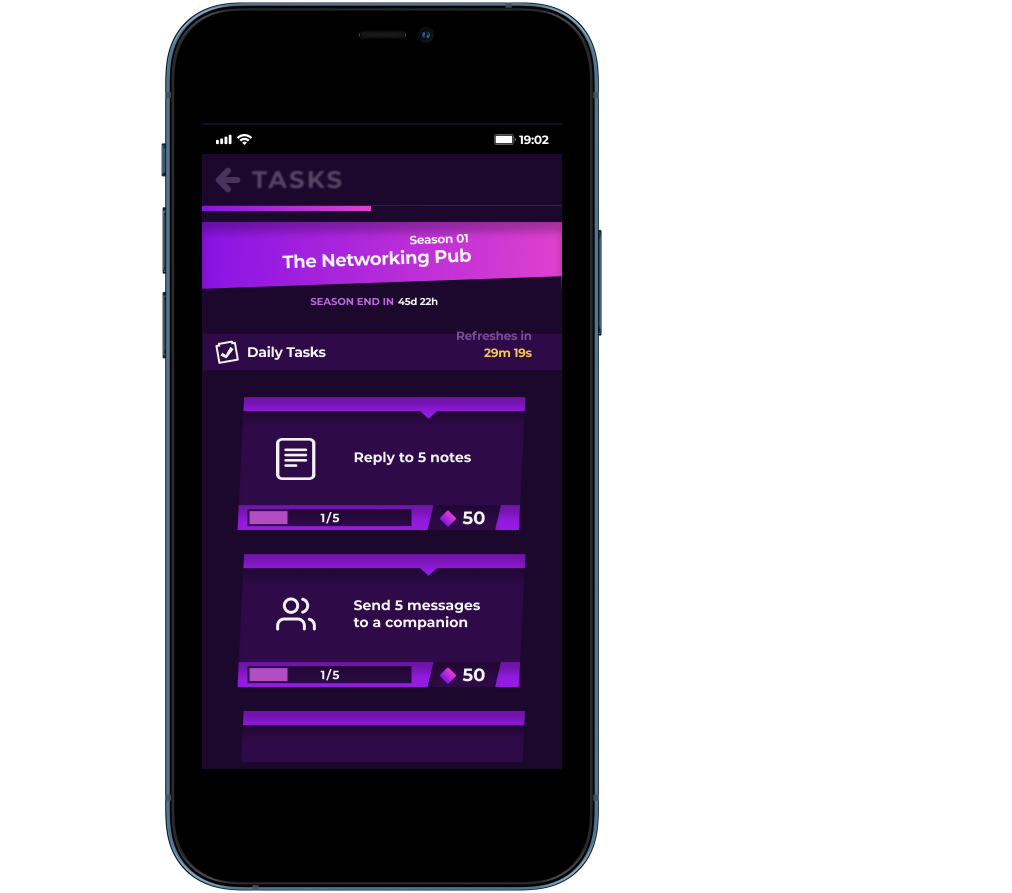
Gamified messaging: After adding someone as a companion, users can have a long term conversation with each other within the app. Both users will share a progress bar that increases gradually as they send messages back and forth. Upon reaching to the max, users will be able to unlock hidden information from each other, profile which will allow them to understand each other better.
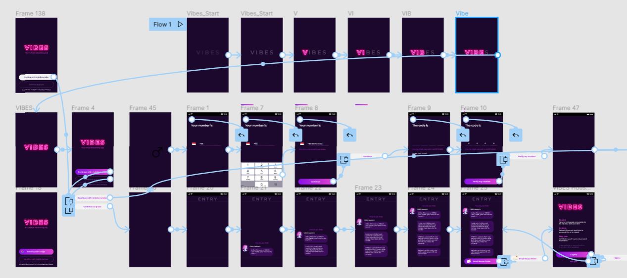
HIGH FIDELITY DESIGN + PROTOTYPE
An interactive prototype allows me to communicate my ideas across to potential clients and users better
Below is a little snip pic of how I linked up the screens in Figma as well as a button link for you to experience the prototype hands on :)
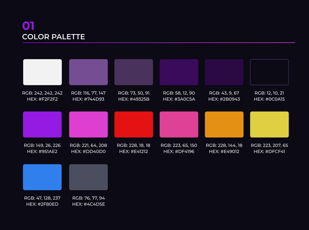
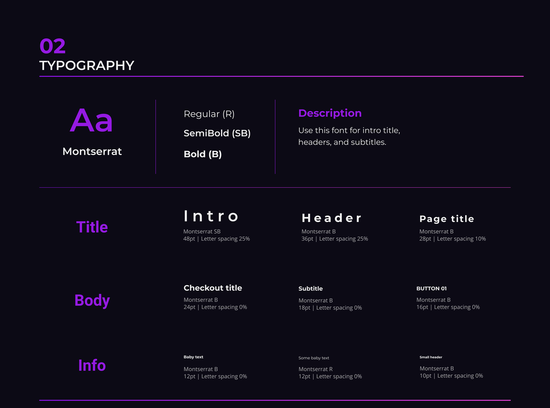
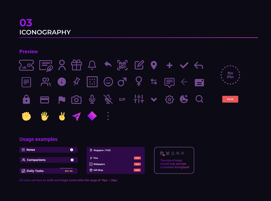
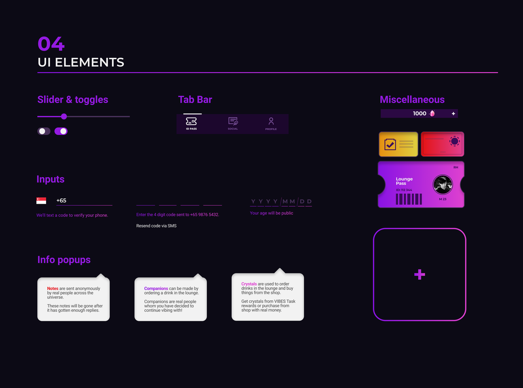
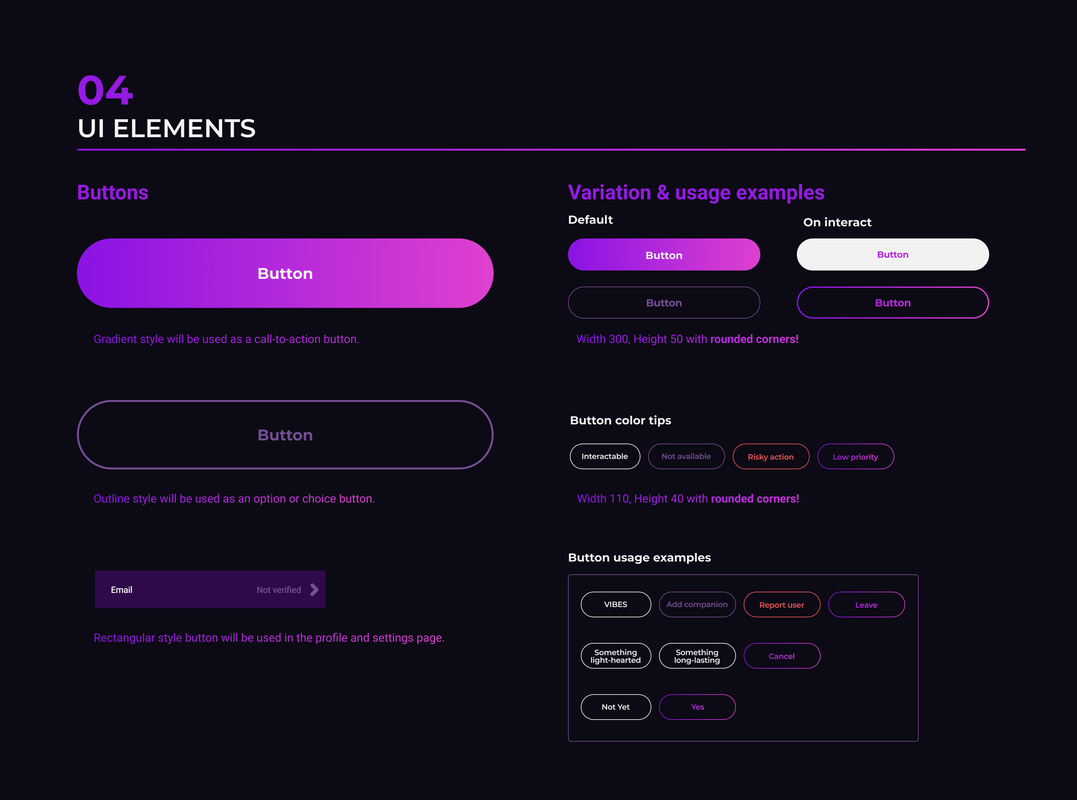
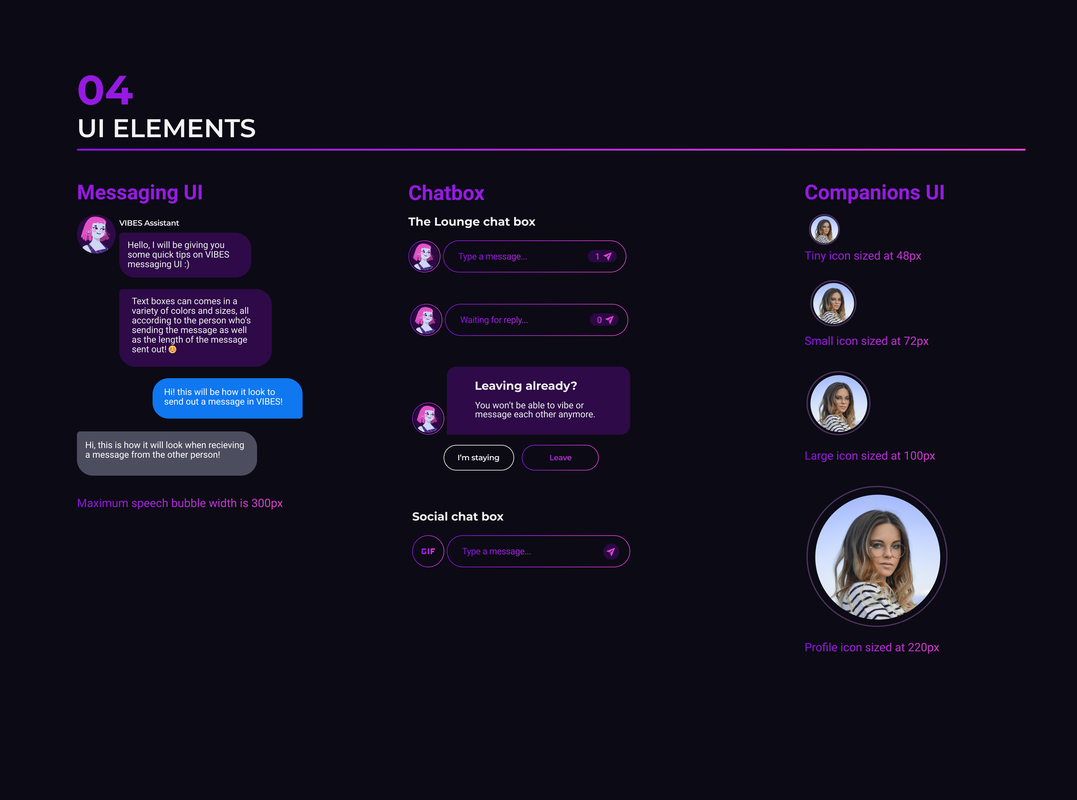
DESIGN STYLE
VIBES Style Guide
|
|
REFLECTIONS
I learned that designing a product is a constant iteration
- Many of the iterations and improvements were built upon the feedbacks and pain points gathered from the target users
- Having a specific target group in mind has been a great help in aligning the vision and style of the app
© 2020 by Chu Rui Heng. All rights reserved.
